Path bar design
We've long wanted an improved path bar widget. @bertob recently did some designs, and @snwh has also done some work of his own.
I thought that it would be good to go over the design goals and explore relevant art before we settle on a design.
Goals
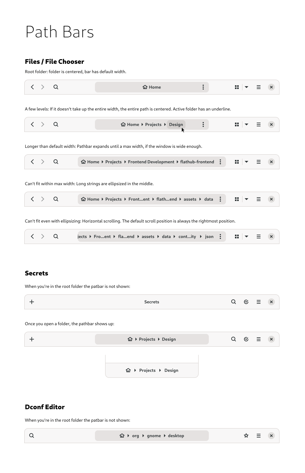
- Ideally be a generic path bar widget appropriate for different apps
- Special handling and considerations for file paths, since that is the most prominent path bar we have
- Should be adaptive
- Suitable for short or long paths
- Goals for file paths:
- Allow switching between a graphical representation of the path and a text path. Also convert to a search bar.
- Simplify away technical details of the file system. For example, don't expose
/home/user/when in home. - Show a variety of possible "root" locations - the user's home, removable devices, network drives, etc
- Path directories should work as drop targets
- As far as possible, cater to long paths with long directory names [1]
[1] An example from the wild: /shared-directory/1859402 - project_name_test_category_description_context1_variant-B82-134-Input/012_part_category_description/43_section_description/92_part_long_description_details_12/1390294-test-name-resultfile_run12900283_job90284201.log (3rd copy).extension
Relevant art
Windows
Standard appearance:

Right click on a directory in the path shows a context menu with items for:
- Copy address
- Copy address as text
- Edit address
- Delete history
The arrows in the path can be clicked separately; each one shows a menu of all the subdirectories at that point.
If the path name doesn't fit, instead of ellipsizing directory names, directories closest to root are hidden, with an arrow to indicate that they are overflowing:

Pressing the` arrow shows a menu with the items that have overflowed (plus others, presumably quick links or similar):

Mac
Path bar not shown by default - it's a setting. Each of the locations in the current path is shown in a drop down if you click the current location in the header bar, though:

When the bar runs out of room, width is preserved for the current directory, its parent, and the root directory, with other directories being shrunk and ellipsized:


Google Drive

Current location acts as a menu button. Contains items such as new folder, share, rename, move, download, delete.
When the available space is exceeded, it seems that each location is ellipsized by the same proportional amount.
Tentative design