Redesign the main user experience
GNOME To Do currently uses the GNOME pattern for content (media?) applications, which is composed of:
- Headerbar with a views switcher
- Views:
- Lists
- Today
- Scheduled

Turns out, this kind of layout is not scalable enough for what GNOME To Do aims. As it grows on features and integrations, this layout is showing some limitations:
- The icons cannot have 3 (provider, account & list) labels
- Panels show up on the headerbar, and this increases way too much the minimum horizontal width of To Do
I believe we can craft a better user experience using a sidebar. See below.
References
Microsoft To Do
Has a nice-looking header over the tasklists, but it consumes too much vertical space.

Nozbe
Looks unprofessional.

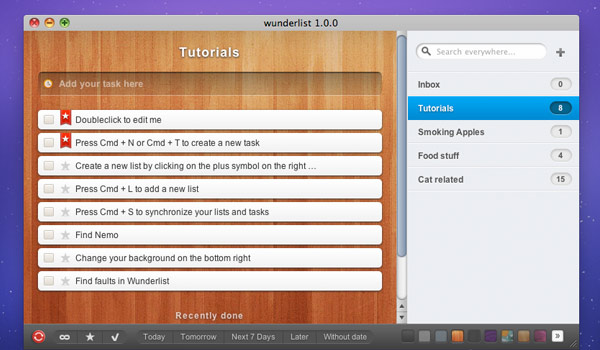
Wunderlist
Apple Reminder
Very simple and focused, lacks many features we support. Has a sexy blurred sidebar.

Remember The Milk
Filled with features, but looks incredibly crowded, and the use of colors is suspicious.

Todoist
Simple and streamlined. Has a loose approach to tasks order.

Todo Cloud
Has an interesting "Focus List" item.

Proposed Mockups:
(Add mockups of the proposed feature)
Tasks
Design
-
Switch to a sidebar-based layout -
Rearrange headerbar widgets -
Improve recognition of services and accounts -
New app icon (#202 (closed)) -
Add a color palette (#203 (closed)) -
New symbolic icons (#206 (closed)) -
Port to GTK4 (#205 (closed))
Development
-
Implement the proposed designs